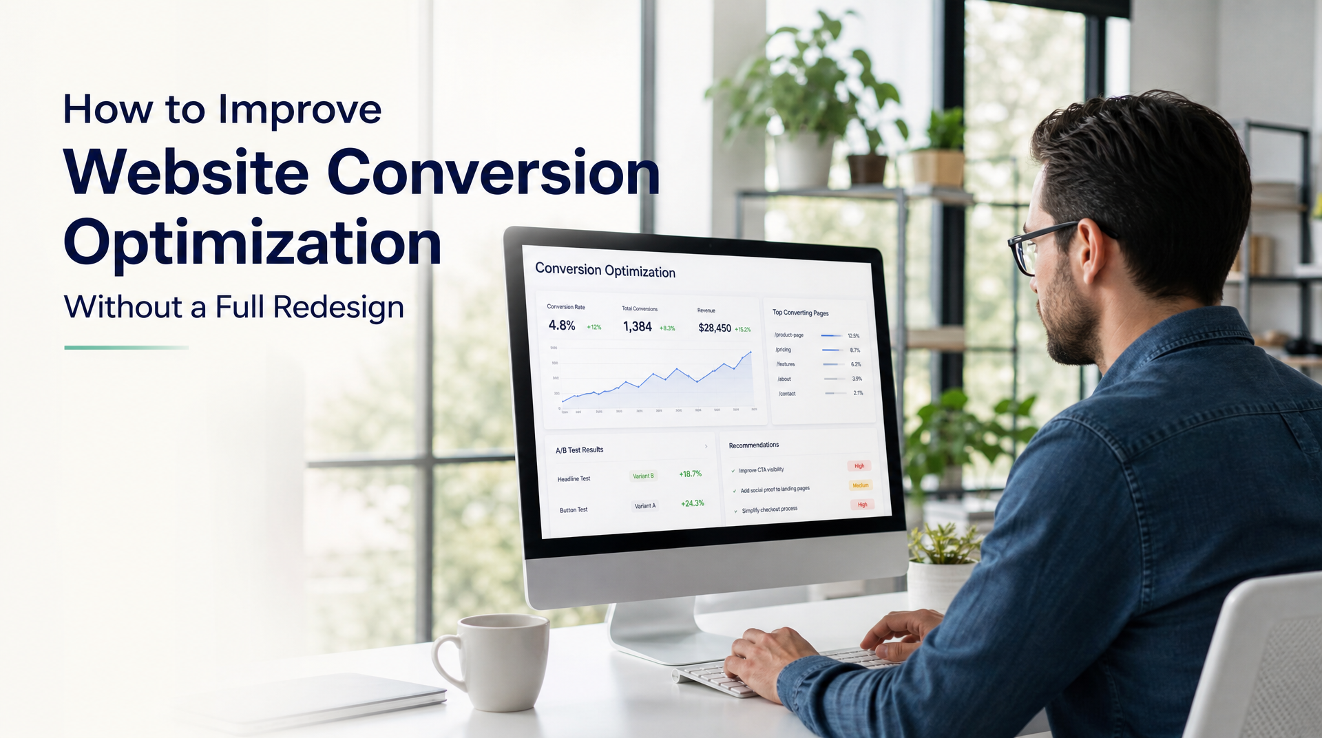
A full website redesign can be valuable, but it is not the only way to create more useful inquiries. Many growing businesses lose potential leads because visitors cannot quickly understand the offer, find proof, or take the next step with confidence.
This guide explains how website conversion optimization can improve an existing site for business owners and teams that need clearer inquiry paths without unnecessary disruption. You will learn how to find friction on key pages, make calls to action easier to follow, strengthen trust, and connect inquiry follow-up so good leads do not sit unanswered.
Start With the Visitor Journey, Not a New Design
Conversion work starts by understanding what a visitor is trying to accomplish. A prospect may be comparing providers, checking whether you serve their area, looking for a specific service, or deciding whether it is worth making contact. If the site makes that decision harder, a visual refresh alone will not fix the problem.
Look at the journey from the visitor's perspective. Can they identify what you do, who you help, why they should trust you, and what happens after they get in touch? These are practical questions that reveal where a page needs attention.
Define the one action each page should support
Every important page should have a clear primary job. A homepage may guide visitors toward a consultation or service page. A service page may encourage a quote request. A landing page design built for a campaign may focus on one action, such as booking a call or requesting an assessment.
Problems arise when a page presents several equally prominent actions. For example, a visitor sees buttons for a brochure, newsletter, careers page, generic contact form, and social profiles before they understand the main offer. Keep secondary links available, but make the most useful next step obvious.
Ask these questions for each high-traffic page:
- What question brought the visitor here?
- What information do they need before contacting us?
- What is the primary action we want them to take?
- Is that action visible before they need to scroll?
- What could make them hesitate or leave?
Review the path from search to inquiry
A website should not be judged as an isolated homepage. Review the actual routes people take: local search result to service page, referral link to homepage, paid campaign to landing page, or returning customer to contact page. The message and next step should remain consistent across that path.
For businesses competing locally, location details matter when they are relevant. A prospect searching for a nearby provider may want confirmation that you work in their city or can serve their type of project. Clear local relevance can support local SEO Toronto efforts when Toronto is genuinely part of the business's market, but avoid vague location lists that do not help a buyer make a decision.
A simple journey review often finds quick wins: a search result that promises one thing while the page opens with another, a service page without a contact route, or a form that provides no expectation of what happens next.
Find Friction With a Focused Homepage Review
Your homepage is often a first credibility check, especially for referral traffic and visitors comparing several providers. It does not need to explain every detail of the business. It does need to make a convincing, easy-to-follow case for taking the next step.
A useful homepage review looks beyond colours, fonts, and personal preference. Focus on clarity, relevance, proof, and action.
Make the opening message immediately clear
The first screen should answer three questions in plain language: what do you provide, who is it for, and why should a visitor continue? Broad statements such as “solutions built for success” force visitors to do too much interpretation.
A clearer opening might name the service, the customer type, and a practical outcome. For example, a professional service business could say it helps growing companies simplify a particular process, followed by a direct invitation to discuss their needs. This is more useful than a slogan that could apply to any business.
Keep the primary call to action close to this message. Use action language that matches the decision being asked for, such as “Request a project consultation,” “Get a quote,” or “Discuss your requirements.” “Learn more” has a place when a visitor needs education first, but it should not become the only route to contact.
Build trust before asking for commitment
Visitors usually need reasons to believe the business can deliver. Trust signals are not decoration. They answer the quiet questions that delay an inquiry: “Have they done this before?” “Do they understand my situation?” “Will working with them be straightforward?”
Choose proof that is specific and easy to verify. Useful options include short client testimonials with context, selected project examples, a clear process, credentials where relevant, team information, and realistic descriptions of outcomes. A case example does not need dramatic claims to be effective. Explaining the original problem, the work completed, and the resulting improvement is often enough.
Avoid placing every proof point in one crowded block at the bottom of the page. Add reassurance near moments of commitment, such as before a form or beside a consultation call to action.
Use a homepage review to prioritize, not endlessly tweak
Not all issues deserve the same effort. The following framework helps teams decide where to begin.
| Area to review | Common friction | Practical improvement | Likely business impact |
|---|---|---|---|
| Opening message | Visitors cannot tell what you offer | State service, audience, and outcome plainly | Better relevance and engagement |
| Calls to action | Too many choices or weak labels | Use one primary next step per page | Clearer inquiry path |
| Service navigation | Key services are hard to find | Group services around buyer needs | Faster self-selection |
| Proof | Claims appear unsupported | Add testimonials, examples, and process details | Stronger credibility |
| Contact route | Form is hidden or too demanding | Make contact visible and reduce unnecessary fields | Less abandonment |
Start with the issue that affects the most important visitor path. A polished footer is rarely more urgent than a homepage that does not say what the business does.
Improve Service Pages and Landing Page Design
A strong service page helps a prospect decide whether your offer fits their need. It should be more focused than a homepage and more practical than a general company overview. Good landing page design follows the same principle: one audience, one problem, one clear route forward.
Answer buyer questions in the order they arise
Most prospects want to know what the service involves, whether it applies to their situation, how the engagement works, and what they should do next. Put those answers in a logical sequence instead of burying them in a long block of brand language.
A useful service-page structure can include:
- A clear service statement and intended customer.
- The problems or situations the service addresses.
- A plain-language explanation of the approach and deliverables.
- Relevant examples, proof, or common use cases.
- A direct next step with realistic expectations.
Be transparent about the process without overwhelming visitors with internal detail. For example, explain that an initial conversation clarifies goals and scope, rather than listing every internal project task. This reduces uncertainty while keeping attention on the buyer's decision.
Reduce form friction without reducing lead quality
Long forms can discourage busy decision-makers, while overly minimal forms may not give your team enough context. The right balance depends on what is needed to start a useful conversation.
Ask only for information your team will use immediately. Name, work email, company, and a short project description may be enough for an initial inquiry. If budget, timeline, or service selection is important, explain why you are asking and make choices easy to complete.
The form experience also continues after submission. Replace a generic “thank you” with a confirmation that states what happens next. Let people know whether they will receive an email, when the team typically responds, and whether they should prepare anything for the conversation. This small detail makes a business appear organized and dependable.
Make Website Conversion Optimization Measurable
Website conversion optimization is a disciplined process of reducing barriers to meaningful actions. It is not a one-time exercise in changing button colours or chasing every visitor. The goal is to learn which pages and paths support qualified conversations, then improve them in a deliberate order.
Track meaningful actions, not just page visits
Traffic alone does not show whether a website is helping the business. Track actions connected to real intent, such as completed inquiry forms, booked calls, phone link clicks, quote requests, or downloads that lead into a sales process.
Define a conversion in a way that reflects quality as well as volume. A generic newsletter sign-up and a detailed project inquiry may both be valuable, but they should not be treated as identical outcomes. Where possible, review leads with the team that handles them and identify which sources and pages produce conversations worth pursuing.
Keep tracking practical. Start with a small set of actions, confirm that they are recorded correctly, and review them regularly. A conversion-focused web design partner can help connect tracking to the pages and decision points that matter rather than producing a dashboard full of unused numbers.
Test changes with a clear hypothesis
Make changes because you have a reason to expect an improvement. A hypothesis might be: “If we clarify who this service is for near the top of the page, fewer unsuitable visitors will submit inquiries and qualified prospects will continue.”
Change a manageable number of elements at a time, particularly on pages with steady traffic. Record what changed, why it changed, and what you observed. This creates useful institutional knowledge and prevents the site from becoming a collection of unexamined edits.
Qualitative feedback matters too. Ask new clients what they understood from the site, what almost stopped them from contacting you, and which page helped them decide. Their answers can uncover confusion that standard reports cannot show.
Connect Faster Follow-Up to the Inquiry Path
A better form is only useful if the business responds reliably. For many teams, the real gap is not lead generation but the time between an inquiry arriving and the right person seeing it. Website inquiry automation helps close that gap without requiring a complicated replacement for the tools a team already uses.
Route inquiries to the right place
Map what happens after someone submits a form. Does the message sit in a shared inbox? Is it manually copied into a CRM? Does someone need to decide who owns the response? Each handoff introduces the possibility of delay or missed information.
Lead automation can send an immediate acknowledgement to the prospect, notify the responsible team member, create a follow-up task, and record the inquiry in an existing system. The aim is not to automate every client interaction. It is to ensure a legitimate opportunity has a clear owner and a timely first response.
Use CRM connections that fit the existing process
CRM connections should support how your team actually works. If the sales team already uses a CRM, the website should send useful inquiry details there in a consistent format. If a small team works primarily from an inbox and shared task list, a lighter workflow may be more appropriate.
Before setting up automation, agree on the basics: who receives each type of inquiry, what response time is realistic, what information must be captured, and when a lead is considered qualified. Automation then reinforces a working process instead of hiding a broken one.
This is especially important for service businesses where a thoughtful response builds trust. An immediate confirmation can set expectations, while the actual reply remains personal and informed.
Know When Targeted Improvements Are Not Enough
Targeted improvements are often the sensible first step, but they cannot solve every website problem. If the site is difficult to update, structurally confusing, inconsistent across core pages, or disconnected from the current business model, a broader project may be the better investment.
The decision does not have to be based on appearances. It should reflect the business's goals, the scale of the underlying issues, and the cost of continuing to work around them.
Signs a focused improvement project is a good fit
A focused project may be appropriate when your existing site has a sound foundation but key pages are unclear or underperforming. Examples include a homepage with weak positioning, a valuable service buried in navigation, a quote form that creates unnecessary work, or a missing follow-up workflow.
This approach can create progress with less disruption. It also helps a team validate messaging and processes before committing to a larger website design for growing businesses.
Signs you may need a broader rebuild
Consider a larger project when the site no longer reflects your service offering, the navigation makes it hard to find essential information, mobile use is unreliable, or multiple important pages need new structure and copy. A rebuild may also be warranted when the current platform prevents basic updates or makes inquiry tracking impractical.
The right partner should explain the trade-offs clearly. At Bayline Digital, that means reviewing what is already working, identifying the highest-impact gaps, and recommending practical next steps rather than treating every site as a full redesign opportunity. Direct access to the people planning and building the work helps keep those recommendations grounded in the business need.
Key Takeaways
- Begin with the visitor journey and make one primary action clear on each key page.
- Use a focused homepage review to improve clarity, proof, navigation, and contact routes before changing visual details.
- Build service pages and landing pages around buyer questions, then reduce unnecessary form fields.
- Track meaningful inquiries and improve pages with a clear hypothesis, not random changes.
- Pair website improvements with lead automation and CRM connections so timely follow-up matches the quality of the inquiry path.
A stronger website does not always require starting over. Clearer messaging, easier next steps, credible proof, and dependable follow-up can make your existing site much easier for the right customers to choose.
COMMON QUESTIONS
Questions from this article.
Can I improve website conversion without a full redesign?
Yes. Many sites improve with clearer messaging, stronger calls to action, better service pages, simpler forms, and more reliable inquiry follow-up. A review can identify whether focused updates are enough.
What should I check first in a homepage review?
Check whether visitors can quickly understand what you do, who you help, why they should trust you, and what action to take next. Then review navigation, proof, mobile usability, and the contact path.
What is website inquiry automation?
Website inquiry automation connects form submissions to useful next steps, such as acknowledgement emails, team notifications, follow-up tasks, or CRM records. It helps reduce delays and missed leads.
How many fields should a website inquiry form have?
Use only fields your team needs to start a useful conversation. For many service businesses, contact details, company name, and a short project description are enough. Add qualifying questions only when they help the response.